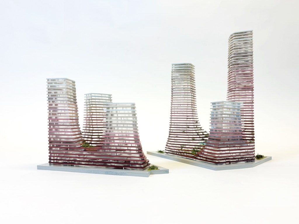
Water Towers
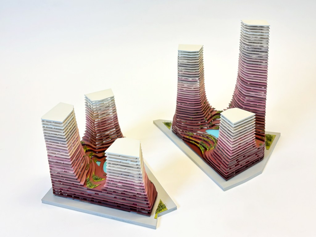
The Water Towers competition was an opportunity to integrate key design principles central to MVRDV's architecture, including innovative concepts, smart construction methods, parametric design and model making. This complex project, transitions from a commercial plinth into a semi-public square, from which six towers ascend to varying heights, reaching towards the sky. Crossed by a large canal, the towers share a cohesive aesthetic while each housing its own distinct program.
model created during a tenure at MVRDV. Ownership credited to the firm.

competition model | 1:300
materials: Cast Acrylic, MDF wood and mixed media
client: confidential
architect: MVRDV Architects
location: Rotterdam, 2024
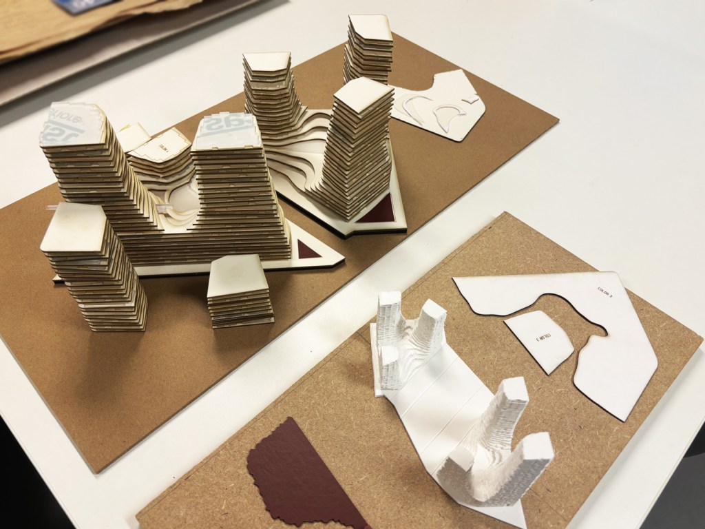
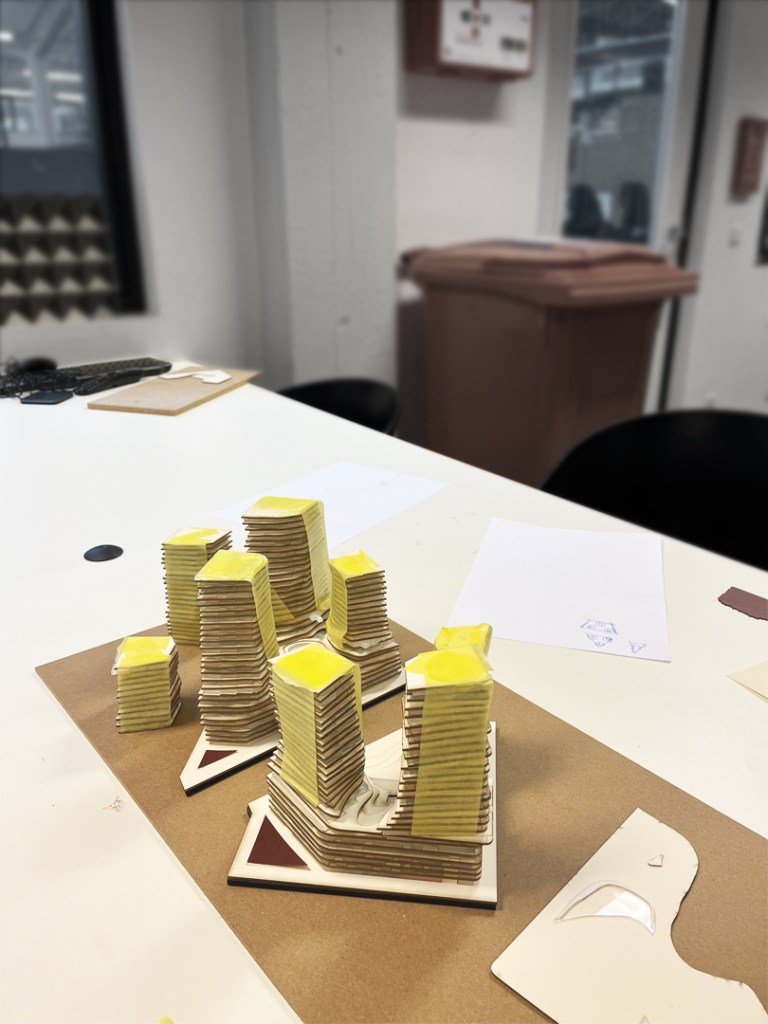
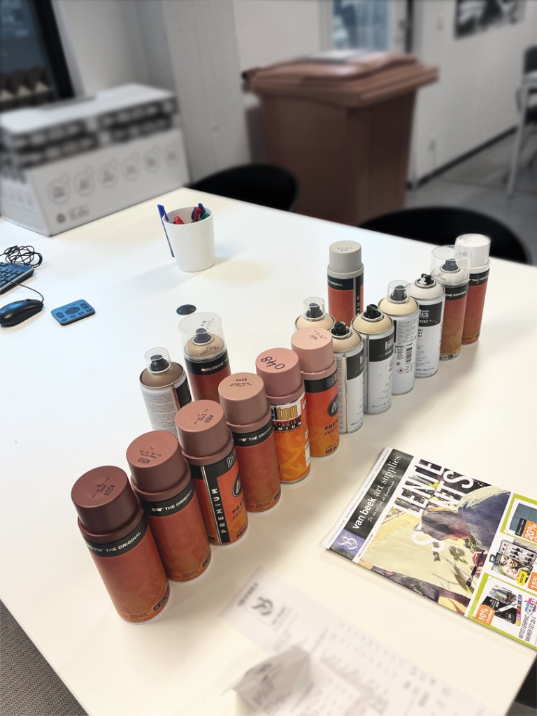
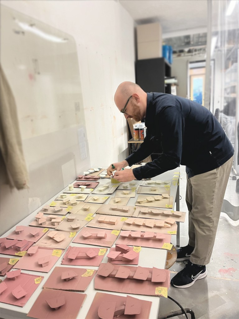
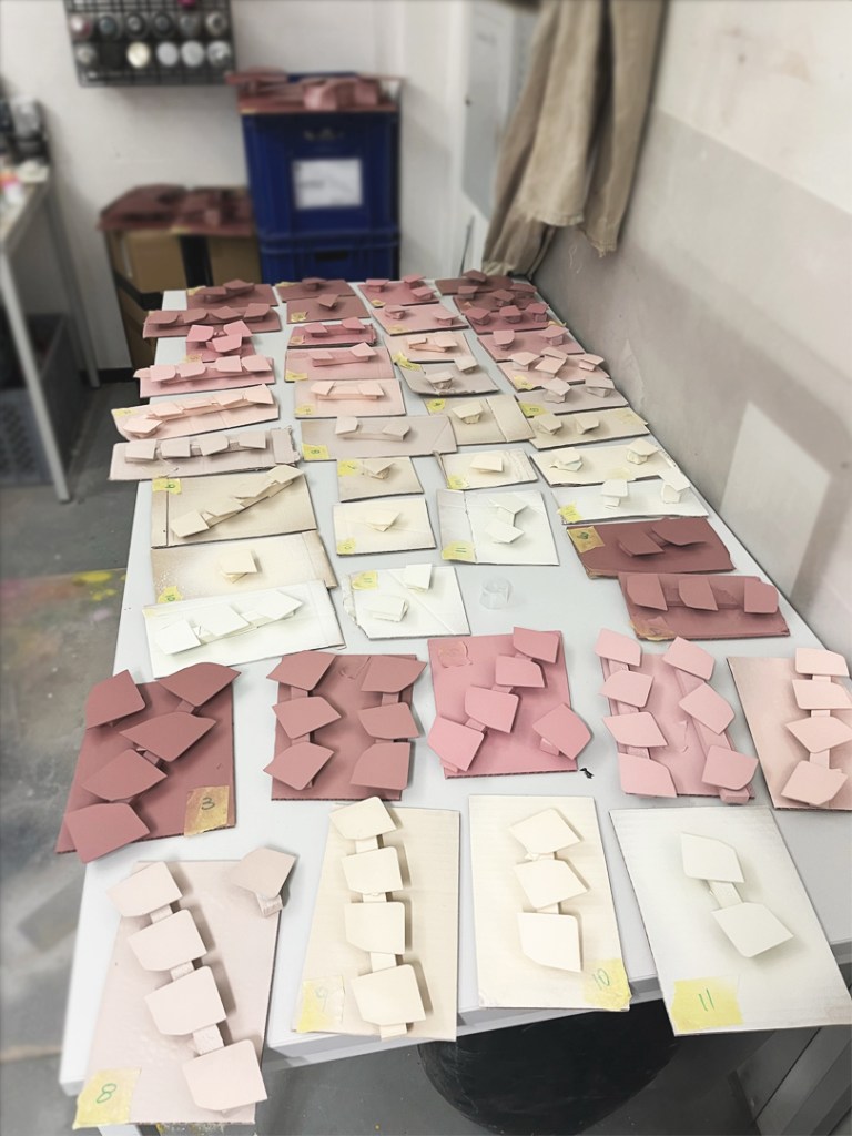
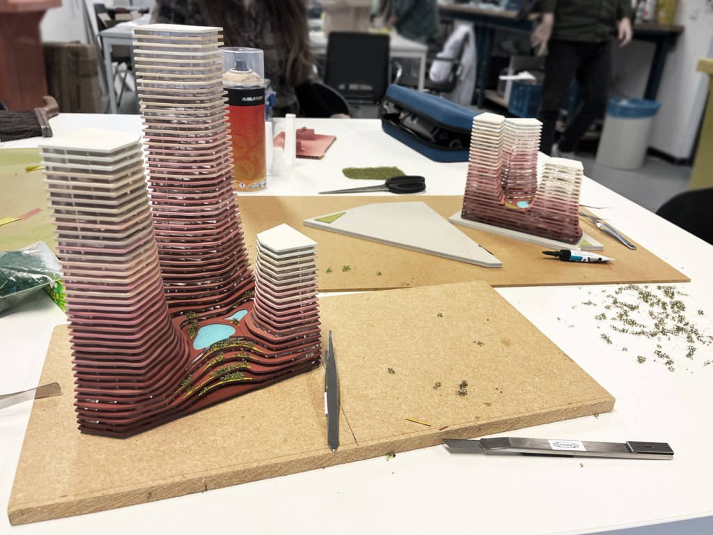
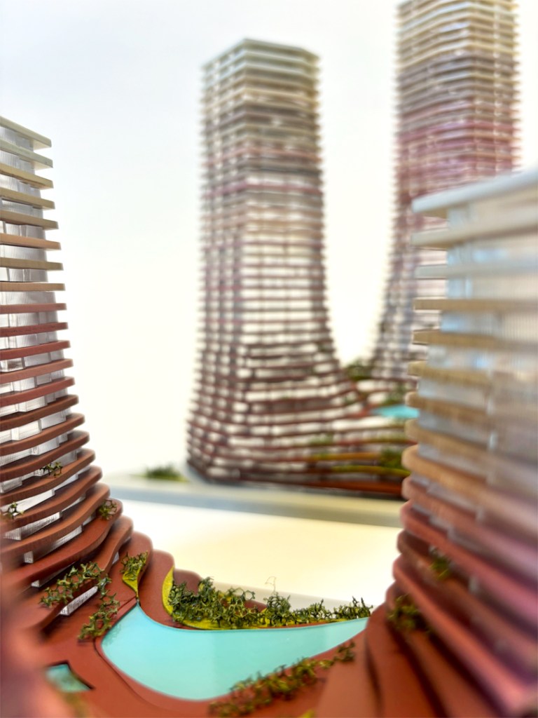
In a competition model, it's essential to showcase the core concepts of the proposal, highlight its key selling points and stand out from the competitors through both design and execution. For this model, we emphasized the craftsmanship of traditional model-making techniques, using high-quality materials to reflect the proposal’s elegance. We integrated parametric technology in both the design and fabrication processes, allowing us to quickly update the model and incorporate smaller details such as planters and water features, achieving an accurate representation of the proposed architecture. With the site model being at location, the focus was on the proposed building mass.

A key aspect of the design are the transparent floors nestled between slabs and balconies. Their subtle variations in size and shape as the tower ascends create the desired sight lines and the sharp, crisp aesthetic envisioned by the architect. In this densely built district, the six towers offer unobstructed, full-width views of the surrounding landscape. The model's use of stacked materials effectively showcases the project's verticality and the panoramic views of each floor.
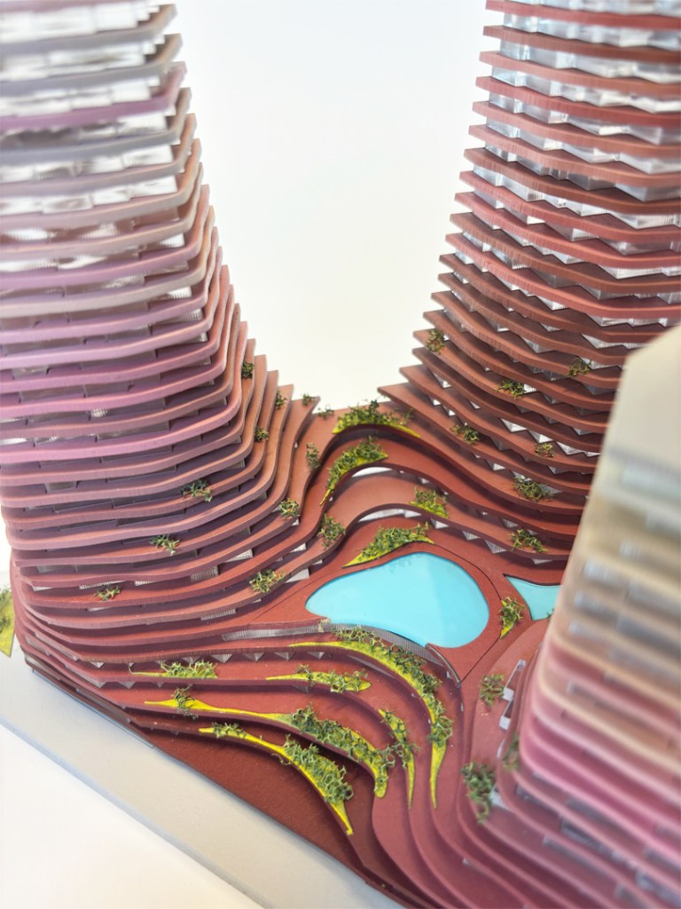
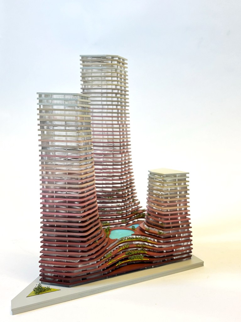
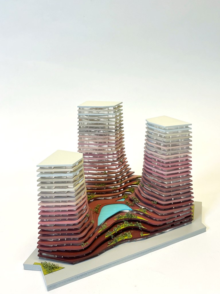
We further accentuated the design's elegance with a gradient color scheme. The transition from burgundy and pink at the solid, robust base floors (commercial and public) and off-white are to intentionally make a distinction between the solid, strong base floors (commercial, public) to off-white at the airy, almost sky-blending top floors (housing and private). This coherent color palette was crucial for aligning the model with accompanying renderings, diagrams, and drawings, ensuring a unified presentation of the design and a vital chance for the team to find solutions together.